Here come some stunning examples of data visualizations, all built with R. R code of each diagram is available at the source. Enjoy! #beautiful.
UPDATE: I’ve included links to the R source!
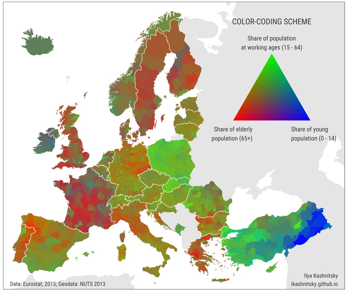
Plotting geo maps along with subplots in ggplot2
I like this one by Ilya Kashnitsky:

Similarly, by the same author:
Great work, @ikashnitsky!
Cirlize (Chord) diagrams
Plotting association in a circular form yields aesthetic examples of diagrams, see the following examples


Source: This work is from Zuguang Gu; see his package circlize. He is also the author from the corresponding free online book.
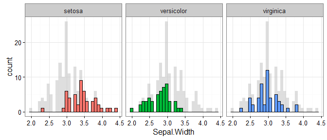
Grey is your best friend
Providing contect to your data is an important principle in data viz. For example, show the overall data when you focus on a subgroup.
Simon Jackson (@drsimonj) gives a great example:
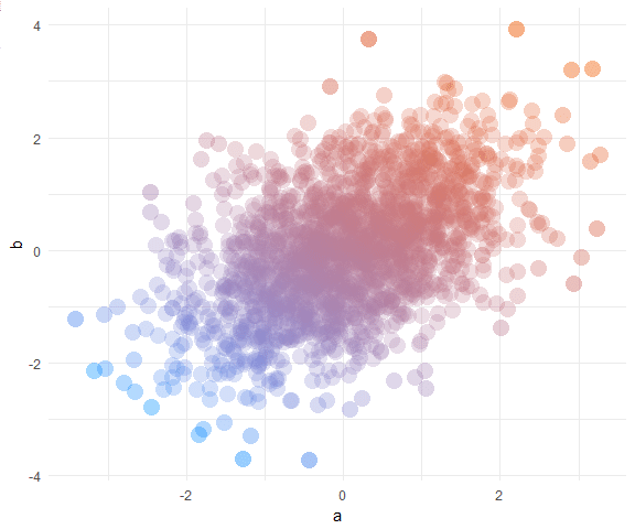
Beautitful scatter plots
Again, Simon Jackson does it:
Maps with grid

Source: See many more examples of nice diagrams at The R Graph Gallery
Clean chloropleth map
An example of a clean chloropleth map, again from The R Graph Gallery

For a different choroplatht example using ggplot and geom_sf, check out this post.
Pirate attack
Pirate plots, by Nathaniel Philips, are available by the R package yarrr.
From the documentation on this page:
The pirateplot function creates a pirateplot, a transparent (both literally and figuratively) plot for displaying continuous data as a function of 1, 2, or 3 discrete variables. Unlike traditional plots, like barplots and boxplots, the pirateplot shows both raw data (jittered points), descriptive statistics (line and/or bar), and inferential statistics (95% Bayesian Highest Density Intervals or Confidence Intervals), in one plot. While the default plot shows all these elements, the user can easily customize the transparency of each element using additional arguments. See ?pirateplot or https://CRAN.R-project.org/package=yarrr for more details
Clean R graphs comependium
The Compendium of Clean Graphs in R presents a gallery of, surprise, clean graphs. The graphs are often “simple” in the sense that they do not convey a hell of a lot information, and graph junk is seriously avoied. Many examples are suitable for academia settings.
Survey results with Thomas Rahlf’s book
This example from Thomas Rahlf’s book Data Design with R is nice:

Again suitable for survey results, but somewhat more advanced:

Unfortunately, the R code from Thomas Rahlf’s book is not freely available; however, it is presented in detail in the book.
Heatmap
By Thomas Rahlf again; there are many examples of heat or tile maps, but this is one is particularly nice - although made with base R, no ggplot.

Time series
This one by Thomas Rahlf is nice:

Similarly, and “cleaner”:
 )
)
Cab drivers in NYC
Todd Schneider did a great job in this post where he anylzed 1.1 billion cab drives in NYC. Particularly, the visualization of the “cab density” is appealing:
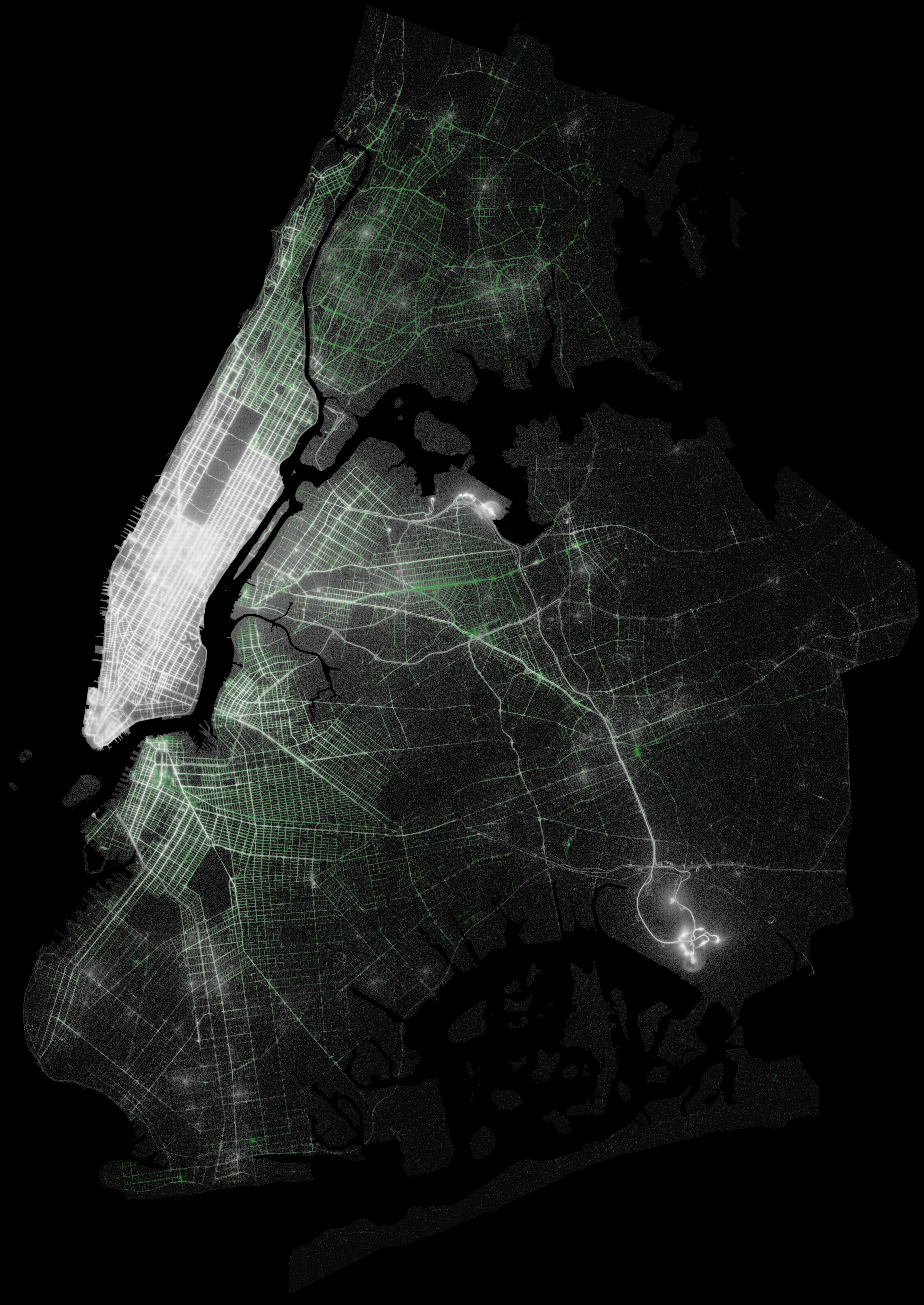
Source; in this file in his Github repo resides most of the R code.
Enjoy & More
There a many more great data viz examples out there, including those build on R. I find this curation quite nice.