Teaching or learning stats can be a challenging endeavor. In my experience, starting with concrete (as opposed to abstract) examples helps many a learner. What also helps (for me) is visualizing.
As p-values are still part and parcel of probably any given stats curriculum, here is a convenient function to simulate p-values and to plot them.
“Simulating p-values” amounts to drawing many samples from a given, specified population (eg., µ=100, s=15, normally distributed). We could ourselves go out and draw samples (eg., testing IQ of strangers). As the computer can do that too and does not mourn about repetitive tasks, let’s leave that task to the machine.
Simulation can be easier to comprehend than working with theoretical distributions. It is more tangible to say “we are drawing many samples” then to speak about some theoretical distribution. That’s why simulation can be of didactic value.
So, here you can source an R function which will do the simulation plus plotting job for you.
source("https://sebastiansauer.github.io/Rcode/clt_1.R")
Note that dplyr and ggplot need to installed.
Use the function simu_p(). It can be run without parameters:
s1 <- simu_p()
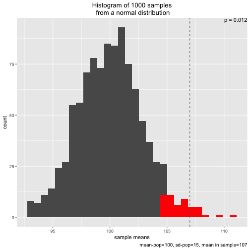
The plot shows the sampling distribution, the 5% sample means with highest values, the p-value, and the mean of the sample actual drawn (dashed line)
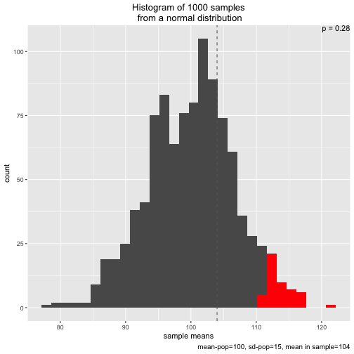
However, one is free to adapt the parameters, eg., experimenting with smaller or larger samples sizes, or a different sample mean:
s2 <- simu_p(n_samples = 1000, mean = 100, sd = 15, n = 5, distribution = "normal", sample_mean = 104)
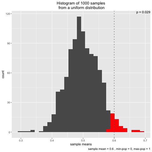
Note that two types of distribution to draw from are implemented: normal and uniform:
s3 <- simu_p(distribution = "uniform", sample_mean = .6)
Initially, I wrote the function to demonstrate the central limit theorem. That’s why two different distributions (normal and uniform) are implemented.
Note that the p-value presented here is of type greater than only, for didactic reasons.
The object returned, eg. s2 contains the values, a cumulative percentage, and an indication whether a certain sample mean was smaller or larger than the significance level, or the sample mean, respectively:
head(s1)
##     samples   perc_num max_5perc greater_than_sample
## 1 101.73581 0.74374374         0                   0
## 2 102.74671 0.84484484         0                   0
## 3  93.98155 0.01501502         0                   0
## 4  98.10223 0.25825826         0                   0
## 5 100.50964 0.56456456         0                   0
## 6 100.17396 0.52152152         0                   0
Here is the source code of the function simu_p():
simu_p <- function(n_samples = 1000, mean = 100, sd = 15, n = 30, distribution = "normal", sample_mean = 107){

  library(ggplot2)
  library(dplyr)


  if (distribution == "normal") {
    samples <- replicate(n_samples, mean(rnorm(n = n, mean = mean, sd = sd)))

    df <- data.frame(samples = samples)

    df %>%
      mutate(perc_num = percent_rank(samples),
             max_5perc = ifelse(perc_num > 950, 1, 0),
             greater_than_sample = ifelse(samples > sample_mean, 1, 0)) -> df

    p_value <- round(mean(df$greater_than_sample), 3)

    p <- ggplot(df) +
      aes(x = samples) +
      geom_histogram() +
      labs(title = paste("Histogram of ", n_samples, " samples", "\n from a normal distribution", sep = ""),
           caption = paste("mean-pop=", mean, ", sd-pop=",sd, sep = "", ", mean in sample=", sample_mean),
           x = "sample means") +
      geom_histogram(data = dplyr::filter(df, perc_num > .95), fill = "red") +
      theme(plot.title = element_text(hjust = 0.5)) +
      geom_vline(xintercept = sample_mean, linetype = "dashed", color = "grey40") +
      ggplot2::annotate("text", x = Inf, y = Inf, label = paste("p =",p_value), hjust = 1, vjust = 1)
    print(p)
  }


  if (distribution == "uniform") {
    samples <- replicate(n_samples, mean(runif(n = n, min=0, max=1)))
    df <- data.frame(samples = samples)

    if (sample_mean > 1) sample_mean <- .99

    df %>%
      mutate(perc_num = percent_rank(samples),
             max_5perc = ifelse(perc_num > 950, 1, 0),
             greater_than_sample = ifelse(samples > sample_mean, 1, 0)) -> df

    p_value <- round(mean(df$greater_than_sample), 3)

    p <- ggplot(df) +
      aes(x = samples) +
      geom_histogram() +
      labs(title = paste("Histogram of ", n_samples, " samples", "\n from a uniform distribution", sep = ""),
           caption = paste("sample mean =", sample_mean, ", min-pop = 0, max-pop = 1"),
           x = "sample means") +
      geom_histogram(data = dplyr::filter(df, perc_num > .95), fill = "red") +
      theme(plot.title = element_text(hjust = 0.5)) +
      geom_vline(xintercept = sample_mean, linetype = "dashed", color = "grey40") +
      ggplot2::annotate("text", x = Inf, y = Inf, label = paste("p =",p_value), hjust = 1, vjust = 1)
    print(p)

  }
return(df)

}