On a recent psychology conference I had the impression that psychologists keep preferring to show mean values, but appear less interested in more detailled plots such as the boxplot. Plots like the boxplot are richer in information, but not more difficult to perceive.
For those who would like to have an easy starter on how to visualize more informative plots (more than mean bars), here is a suggestion:
# install.pacakges("Ecdat")
library(Ecdat)  # dataset on extramarital affairs
data(Fair)
str(Fair)
## 'data.frame':	601 obs. of  9 variables:
##  $ sex       : Factor w/ 2 levels "female","male": 2 1 1 2 2 1 1 2 1 2 ...
##  $ age       : num  37 27 32 57 22 32 22 57 32 22 ...
##  $ ym        : num  10 4 15 15 0.75 1.5 0.75 15 15 1.5 ...
##  $ child     : Factor w/ 2 levels "no","yes": 1 1 2 2 1 1 1 2 2 1 ...
##  $ religious : int  3 4 1 5 2 2 2 2 4 4 ...
##  $ education : num  18 14 12 18 17 17 12 14 16 14 ...
##  $ occupation: int  7 6 1 6 6 5 1 4 1 4 ...
##  $ rate      : int  4 4 4 5 3 5 3 4 2 5 ...
##  $ nbaffairs : num  0 0 0 0 0 0 0 0 0 0 ...
library(ggplot2)
library(dplyr)

Fair %>%
  filter(nbaffairs != 0) %>%
  ggplot(aes(x = sex, y = nbaffairs)) +
  ggtitle("Difference in extramarital affairs between sexes") +
  geom_boxplot() +
  geom_jitter(alpha = .5, color = "firebrick") +
  theme_minimal()
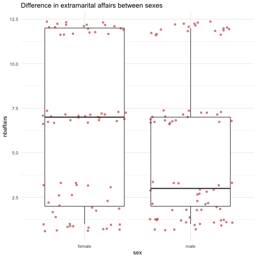
As can be seen, the distribution information reveals some more insight than bare means: There appear to be three distinct groups of “side lookers” (persons having extramarital relations).
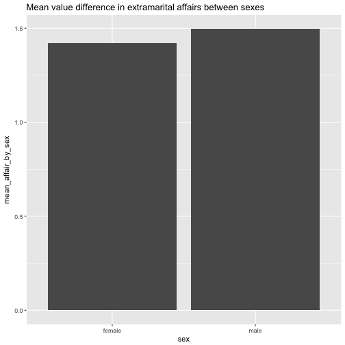
This would not come out if looking at means only:
Fair %>%
  na.omit() %>%
  group_by(sex) %>%
  summarise(mean_affair_by_sex = mean(nbaffairs)) %>%
  ggplot(aes(x= sex, y = mean_affair_by_sex)) +
  geom_bar(stat = "identity") +
  ggtitle("Mean value difference in extramarital affairs between sexes")